Walking Tour of San Francisco
View San Francisco Walking/Public Transportation Tour in a larger map
As I am from northern California and have spent thousands of hours touring the streets of San Francisco, I decided to create a walking tour of the city. This map highlights landmarks, restaurants, transportation, and activites that can all be accomplished in one day. I have incoporated media into my mash-up by adding pitcures and videos to the different landmark locations.
Commentary on Neogeography:
By definition, neogeography encompasses different geographical techniques and tools used for personal activities or for utilization by a non-expert group of users. Neogeography is neither formal nor analytical. Over the past decade, online tools such as Google Maps and Google Earth have popularized neogeographical techniques. These tools have made it possible for any common individual to create his/her own map, without requiring any special education, short of a 1 minute tutorial.
However, as great as neogeography may sound, several pitfalls lie in its wake. For instance, any human or machine can freely create a public map. When viewing these maps, there is absolutely no way of knowing whether the information presented is at all factual. Many of the same concerns that engulf Wikipedia also ascertain to neogeography. The primary concern revolves around a world filled with "amateur" maps, as opposed to professional cartography and GIS. Ultimately, this phenomenon could reduce the number of professional jobs available in the fields of geography and GIS.
Also, several privacy issues emerge with neogeography. For instance, satellite views allow some of the most minute details of people's lives to be observed by anyone with an internet connection. Through these maps, mapmakers can easily mass advertise people's home addresses, phone numbers, schedules, and even voting information.
However, despite these major pitfalls, neogeography possesses ample potential. These open source maps allow for a surge of new, different, exciting, and creative maps to flow across the internet. Neogeography allows amateurs to condense anything from baseball statistics, census data, and political outcomes into a map, presenting data visually. This greatly reduces pressure on the government to create such maps, allowing professionals to focus their energy on greater problems. As described above, consequences, both good and bad, accompany neogeography.
Monday, October 19, 2009
Wednesday, October 7, 2009
Lab 2: USGS Topographical Maps
1. What is the name of the quadrangle?
2. What are the names of the adjacent quadrangles?
3. When was the quadrangle first created?
4. What datum was used to create your map?
5. What is the scale of the map?
6. At the above scale, answer the following:
a) 5 centimeters on the map is equivalent to how many meters on the ground?
b) 5 inches on the map is equivalent to how many miles on the ground?
c) one mile on the ground is equivalent to how many inches on the map?
d) three kilometers on the ground is equivalent to how many centimeters on the map?
7. What is the contour interval on your map?
8. What are the approximate geographic coordinates in both degrees/minutes/seconds and decimal degrees of:
a) the Public Affairs Building;
b) the tip of Santa Monica pier;
c) the Upper Franklin Canyon Reservoir;
9. What is the approximate elevation in both feet and meters of:
a) Greystone Mansion (in Greystone Park)
b) Woodlawn Cemetery
c) Crestwood Hills Park
10. What is the UTM zone of the map?
11. What are the UTM coordinates for the lower left corner of your map?
12. How many square meters are contained within each cell (square) of the UTM gridlines?
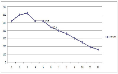
13. Obtain elevation measurements, from west to east along the UTM northing 3771000, where the eastings of the UTM grid intersect the northing. Create an elevation profile using these measurements in Excel Insert your elevation profile as a graphic in your blog.
14. What is the magnetic declination of the map?
15. In which direction does water flow in the intermittent stream between the 405 freeway and Stone Canyon Reservoir?
16. Crop out UCLA from the map and include it as a graphic on your blog:

- Beverly Hills Quadrangle
2. What are the names of the adjacent quadrangles?
- Canoga Park, Van Nuys, Burbank, Topanga, Hollywood, Venice, Inglewood
3. When was the quadrangle first created?
- 1995
4. What datum was used to create your map?
- North American Datum of 1927
- North American Datum of 1983
5. What is the scale of the map?
- 1:24,000
6. At the above scale, answer the following:
a) 5 centimeters on the map is equivalent to how many meters on the ground?
- 1/24000 = 5/x
- x=120,000 cm - convert to meters
- 1,200 meters
b) 5 inches on the map is equivalent to how many miles on the ground?
- 1/24000 = 5/x
- x=120,000 in. - convert to miles
- 1.894 miles
c) one mile on the ground is equivalent to how many inches on the map?
- 1/24000 = x/1
- x=1/24000 miles - convert to miles
- 2.636 inches
d) three kilometers on the ground is equivalent to how many centimeters on the map?
- 1/24000 = x/3
- x=3/24000 km - convert to centimeters
- 12.5 centimeters
7. What is the contour interval on your map?
- 20 feet
8. What are the approximate geographic coordinates in both degrees/minutes/seconds and decimal degrees of:
a) the Public Affairs Building;
- Decimal Degrees: 34.07407N, -118.43927W
- DMS: 34 degrees, 4', 26.65''; -118 degrees, 26', 21.37''
b) the tip of Santa Monica pier;
- Decimal Degrees: 34.00752N, -118.49974W
- DMS: 34 degrees, 0', 27.07''; -118 degrees, 29', 59.06''
c) the Upper Franklin Canyon Reservoir;
- Decimal Degrees: 34.121N, -118.409W
- DMS: 34 degrees, 7', 15.6''; -118 degrees, 24', 32.4''
9. What is the approximate elevation in both feet and meters of:
a) Greystone Mansion (in Greystone Park)
- 560 feet
- 170.7 meters
b) Woodlawn Cemetery
- 140 feet
- 42.7 meters
c) Crestwood Hills Park
- 700 feet
- 213.4 meters
10. What is the UTM zone of the map?
- Zone 11
11. What are the UTM coordinates for the lower left corner of your map?
- 34 degrees, 00'; 118 degrees, 0'
12. How many square meters are contained within each cell (square) of the UTM gridlines?
- 1,000,000 square meters
13. Obtain elevation measurements, from west to east along the UTM northing 3771000, where the eastings of the UTM grid intersect the northing. Create an elevation profile using these measurements in Excel Insert your elevation profile as a graphic in your blog.

14. What is the magnetic declination of the map?
- 14 degrees
15. In which direction does water flow in the intermittent stream between the 405 freeway and Stone Canyon Reservoir?
- South
16. Crop out UCLA from the map and include it as a graphic on your blog:

Thursday, October 1, 2009
Three Interesting Maps
The NYC Subway System
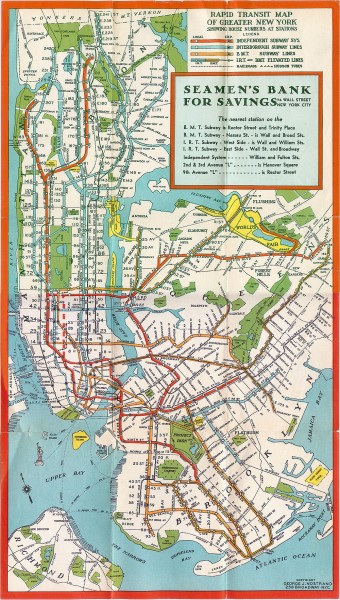
I found this map at the website www.mappery.com. Simply put, the website is a massive database filled with thousands of different "real life" maps. All of these maps either existed at one time, or are still accurate and in use today. This is a map of the New York City Subway system in 1930. The map shows all of the various subway lines that travel through not only Manhattan, but also the other four boroughs. It has different color codes for the different subway lines. However, not only does it show the subway lines, it also shows the geography of New York City. All of the rivers and parks throughout the city are all labeled clearly. What I find especially interesting about this map is its age. Even though it was created during the 1930s, it looks as though it could be a current map. Also, similar to all other transit maps, I find the various colors and designs of the transit system fascinating. The map perfectly captures the grid system of Manhattan.
Los Angeles From Above

This map was found at www.geology.com, a website filled with detailed information regarding Earth science and geography. The website also contains several maps of various geographic interest. This Landsat image provides the viewer with an aerial view of the Los Angeles Basin. Not only does it show the terrain, such as the hills, mountains, valleys, and oceans, it also provides a detailed map of the streets and metropolitan regions. What I find particularly interesting about this map is the intricate detail it provides. It is possible to trace the highways and clearly recognize the massive grid that Los Angeles was constructed upon.
The Literary City

This map was found at www.TheHarperStudio.com, an arts and entertainment blog. In this map, artist Ian Huebert uses famous literary quotes to divide the city of San Francisco into its unique districts. While the map may not be incredibly accurate, it still offers the viewer a clear view of the city from above. With any knowledge of the city, it is clear where one district begins and the other ends. What I find particularly interesting about this map are, first of all, the many colors, and second, the overall creativity. Huebert proves that maps can be a work of art, as well as a necessary tool for direction and movement.

I found this map at the website www.mappery.com. Simply put, the website is a massive database filled with thousands of different "real life" maps. All of these maps either existed at one time, or are still accurate and in use today. This is a map of the New York City Subway system in 1930. The map shows all of the various subway lines that travel through not only Manhattan, but also the other four boroughs. It has different color codes for the different subway lines. However, not only does it show the subway lines, it also shows the geography of New York City. All of the rivers and parks throughout the city are all labeled clearly. What I find especially interesting about this map is its age. Even though it was created during the 1930s, it looks as though it could be a current map. Also, similar to all other transit maps, I find the various colors and designs of the transit system fascinating. The map perfectly captures the grid system of Manhattan.
Los Angeles From Above
This map was found at www.geology.com, a website filled with detailed information regarding Earth science and geography. The website also contains several maps of various geographic interest. This Landsat image provides the viewer with an aerial view of the Los Angeles Basin. Not only does it show the terrain, such as the hills, mountains, valleys, and oceans, it also provides a detailed map of the streets and metropolitan regions. What I find particularly interesting about this map is the intricate detail it provides. It is possible to trace the highways and clearly recognize the massive grid that Los Angeles was constructed upon.
The Literary City
This map was found at www.TheHarperStudio.com, an arts and entertainment blog. In this map, artist Ian Huebert uses famous literary quotes to divide the city of San Francisco into its unique districts. While the map may not be incredibly accurate, it still offers the viewer a clear view of the city from above. With any knowledge of the city, it is clear where one district begins and the other ends. What I find particularly interesting about this map are, first of all, the many colors, and second, the overall creativity. Huebert proves that maps can be a work of art, as well as a necessary tool for direction and movement.
Subscribe to:
Comments (Atom)