Sunday, December 6, 2009

Lab 8: Census 2000/2010


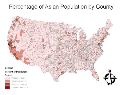
Map 1: The concentration of Asians by county.

In this map, we analyze the distribution of the Asian population across the lower 48 states. It becomes clear that most Asians reside primarily in counties that border the Pacific Ocean. This can most likely be attributed to Asia's relatively close proximity to America's west coast. We also observe that Asians are highly concentrated in urban areas, such as Orange County, Los Angeles County, Santa Clara County, San Francisco County, and Seattle. The Asian community has made tremendous inroads within the technology industry, especially within Santa Clara County's Silicon Valley. Also, we notice concentrations of Asians across the Midwest as well as the Eastern seaboard. This could be due to family roots, friends, and jobs.
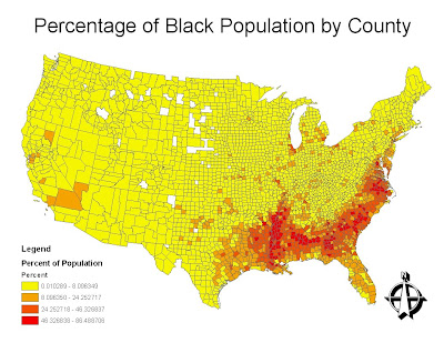
Map 2: The concentration of blacks by county.

This map analyzes the concentartion of the black popualtion across the lower 48 states by county. The concentartion is strikingly clear. Most of the black population is concentrated in the South, especially in Louisiana, Mississippi, Georgia, and South Carolina. Historically, this can be attributed to their original settlement in the deep south resulting from slavery. In addition, in other regions of America, the black population is concentrated around urban centers, such as Detroit, Michigan and Los Angeles, California.
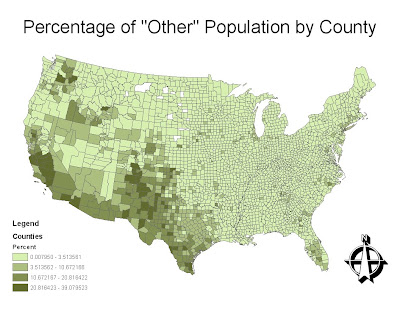
Map 3: The concentration of "other" by county.

This map displays the concentration of "some other race" across the lower 48 states by county. It can be deduced that this category primarily refers to the Hispanic population. The counties with the highest concentrations are along the Mexico-United States border, throughout the Southwest. There is also a significant concentration in the counties surrounding Miami, Florida, which is close to the Latin country Puerto Rico. Agricultural counties, such as California's central valley also contain a significant number of Hispanics.

Concluding Discussion

After mapping and analyzing the census data of these three races, it is possible to reach several conclusions. First of all, each race tends to clump into certain regions of the country. For instance, Asians settle along the Pacific coast, blacks reside in the deep south, and the "other" race lives throughout the Southwest. Each race appears to settle within the urban centers of their chosen regions. However, a second striking observation is that each race is represented in almost every county. With minimal exceptions, every county across the country has an Asian, black, and "other" presence. While these populations may be small in most counties, they are significant. These three maps demonstrate the very racial tendencies that make America a melting pot.

Overall Impressions of GIS

Over the course of this quarter, I have come to realize the extensive potential of GIS. GIS technology provides a unique geographical tool that assists the general public in their understanding of the world. GIS software can transform data into visual and dynamic models that can help to solve some of the world's greatest problems. GIS can manipulate census data to help predict political outcomes. GIS can manipulate forest fire data to aid in fire investigations and prevent future wildfires. Overall, I cannot wait to further understand and learn the tools of GIS, as it will undoubtly become a growing feild in the near future.

Monday, November 23, 2009

Lab 7: Mapping the Station Fire in ArcGIS


Map 1: This map shows the region of Los Angeles County in which the Station fire occurred. The inset provides a close-up image.


Map 2: This graphic displays a Digital Elevation Model of the Station Fire's area. Blue signifies high altitudes and red indicates low altitudes.

Map 3: This thematic map shows the area of the fire in relation to elevations. The area of the fire is overlayed over a shaded relief model.


The Relationship Between Climate, Elevation, and Wildfires

Every year, an average of 1.2 million acres of U.S. land burn every year in wildfires (Westerling, Warming). The Station Fire, the largest wildfire in the history of Los Angeles county, began on August 26, 2009 (Station Fire). Before it was 100% contained on October 16, 2009, the wildfire burned more than 160,000 acres of the Angeles National Forest (Station Fire). In this report I will analyze how climate and elevation can affect the spread and intensity of a wildfire.

In the case of the Station Fire, the severity of the fire only increased with elevation. As can be seen in Map #2, much of the land consumed by the fire is located in an incredibly mountainous region. As elevation increases, it can be incredibly difficult for firefighters to reach the flames, thus permitting the fire to quickly spread (Los Angeles Fire Map). A lack of roads and access points also severely limit firefighters' ability to reach the fire. In Map #1, we notice that the fire primarily spreads inwards, away from the city. Thus it spreads exponentially.

However, much of the cause for this can be directly attributed to the climate of the Angeles National Forest. The particular biome in which of the forest resides is comprised of primarily chaparral. Chaparral biomes are defined by hot and incredibly dry weather. Most of the hillsides and mountainous regions are covered in small shrubs that quite literally act as fuel for wildfires (Westerling, Climate). In fact, chaparral thrive on wildfires. During fires, the chaparral will release new seeds to repopulate the hillsides once the fire has subsided (Hanes). Because of the chaparral, the Station Fire quickly spiraled out of control and spread to new regions.

The chaparral primarily grow at higher elevations, in desolate hillside regions above cities and towns (Westerling, Climate). When a fire occurs in such a region, the effect is similar to striking a match near a gasoline station. This natural phenomenon forms as a result of the hot, dry climate mentioned above. This, combined with the restraining effects of elevation, ensure that most wildfires will occur in desolate hillsides.

As we can see in the shaded relief model, it becomes clear that elevation plays a significant role in the severity of wildfires. Fires spread in the direction of desolation, which more often than not is located in areas of higher elevation. Map #1 displays the location of the fire in relation to the Los Angeles basin and its transportation networks, such as airports and freeways. The fire spreads away from these locations. The Digital Elevation Model displays the three-dimensional elevation profile of the region; the Station Fire spreads to the regions of higher elevations. The shaded relief model further enhances this statement. There is a direct correlation between wildfire severity, climate, and elevation.


Bibliography

Hanes, Ted L. "Succession after Fire in the Chaparral of Southern California." Ecological Monographs 41.1 (1971): 27-52. Web.

Los Angeles Fire Map." Los Angeles Times. Web. 25 Nov. 2009.

"Station Fire". Incident Information System. 9/25/09 .

Westerling, A.L. "Climate and Wildfire inthe Western United States." Bulletin of the American Geological Survey (2001): n. pag. Web. 25 Nov 2009.

Westerling, A.L. "Warming and Earlier Spring Increase Western U.S. Forest Wildfire Activity." Science 313 (2006). Web. 25 Nov. 2009. .

Friday, November 13, 2009

Lab 6: DEMs in ArcGIS

For this lab I decided to analyze the geographical region of Lake Tahoe, California/Nevada. Located high in the Sierra Nevada mountains, the Lake Tahoe region consists of a wide range of elevations. I downloaded the geographic data from the USGS Seamless data server. It uses the information from the NAD 1983 dataset. The geographic coordinates of the four corners are as follows:

Slope Map

Aspect Map

Digital Elevation Model


26236909

Wednesday, November 4, 2009

Lab 5: Projections in ArcGIS

Conformal Map Projections


Mercator Projection


Distance from Washington D.C. to Kabul: 10,119 miles

Gall Stereographic Projection


Distance from Washington D.C. to Kabul: 7,155 miles

Equal Area Projections


Cylindrical Equal Area Projection


Distance from Washington D.C. to Kabul: 10,140 miles

Mollweide Projection


Distance from Washington D.C. to Kabul: 7,953 miles

Equidistant Projections


Plate Carree Projection


Distance from Washington D.C. to Kabul: 10,111 miles

Sinusoidal Projection


Distance from Washington D.C. to Kabul: 8,030 miles

This lab exercise was incredibly interesting as I got the chance to manipulate maps in different ways using different projections. It is fascinating to observe the transformation of the globe according to the certain and unique parameters of different projections. However, as interesting as this technique is, many pitfalls exist within the realm of map projections. As soon as I made my first map projection, I immediately observed and understood the primary pitfall - distortion. However, map projections also provide several benefits to modern GIS and cartography. Projections allow us a way to display the three-dimensional Earth on a two-dimensional plane.

There are three kinds of projections - conformal map projections, equal area map projections, and equidistant map projections. Each of these projections serves a specific purpose. For instance, conformal projections preserve the local angles, thus making them incredibly useful for navigational purposes. The conformal projections I display above are the Mercator projection and the Gall Stereographic projection. Equal area projections preserve area. Thus, these projections are best used for calculating areas of regions and countries. The equal area projections I have displayed are the Mollweide projection and the Cylindrical Equal Area projection. Finally, equidistant projections preserve distances, making them the best projections to use when calculating distances between two fixed points. The equidistant projections I have displayed above are the Sinusoidal projection and the Plate Carree projection.

Projections have numerous pitfalls that cannot be easily overcome. First of all, there is no perfect projection. Some are better than others, but this depends primarily on how the user needs to manipulate the data. Most of these pitfalls emerge from the issue of distortion. A prime example of distortion is the large size of the northern hemisphere on the Mercator projection compared with the small size of the southern hemisphere. Each type of projection will manipulate the map and image in a different way, thus making it incredibly difficult to achieve uniformity. This becomes clear when calculating the distance between Washington D.C. and Kabul, Afghanistan on each of the six projections. Every map delivered a different answer, and almost none were even remotely close to one another.

However, despite the pitfalls, projections have definite potential. For instance, projections allow us to display the three dimensional world in two dimensions. Also, each projection allows us to view the world with a different perspective from what we are ordinarily used to. Map projections allow for easy navigation across the oceans, simple calculations of area, and accurate calculations of distance between points. The key is to use the correct type projection for each, separate need. Projections also allow us to model data, such as the melting of the polar ice cap. Overall, the benefits and potential of projections far outweigh the pitfalls.

Tuesday, November 3, 2009

Lab 4: Introducing ArcMap

Exercise #1


Exercise #2


Exercise #3


Exercise #4


Exercise #5


ArcGIS is a fascinating piece of software that is directly applicable to almost any real life scenario. As I was going through the process of creating my maps, I noticed many similarities to photo-editing software such as Photoshop. For the most part, I thoroughly enjoyed my ArcMap experience. I had no idea that the ArcGIS software had so many capabilities. The concept of using data to create visual maps is incredibly interesting. Even though we simply followed directions in a tutorial, this is the same process that would be used in a real life GIS model.

Possibly the coolest concept of GIS is the ability to layer one data set atop another data set. Through this technique, it became possible to analyze the population density of the city, as well as the zoning of the parcels. I thought it was especially interesting that we could personalize our maps, such as using a different pattern for each zone (such as industry, commercial, and residential). Overall, this is the most rewarding lab I have done so far. Even though it took the most amount of time, it was incredibly interesting to finally get the chance to use actual GIS software.

While the use of GIS as a tool has countless potential, it also has several notable pitfalls. GIS allows geographers to create accurate three-dimensional models of the Earth and its numerous systems. GIS allows us to analyze both continuous and discrete data, and even combine the two types of data sets. In addition, we can use GIS for political purposes in the analysis of a particular proposition. GIS can be used to model nearly any scenario, be it airport expansion or even social issues such as racial segregation.

However, GIS also has significant pitfalls. For instance, to create an accurate GIS, a tremendous amount of data is required. Also, an accurate and detailed model requires a massive amount of storage capacity, such as a hard drive. As GIS is primarily used by professionals, there is not much concern for irresponsible and unregulated use. Most importantly, GIS can be deceiving. Similar to statistics, GIS can manipulate data to shift public policy and public opinion one way or another. For the most part, the benefits of GIS far outweigh the potential pitfalls.

Monday, October 19, 2009

Lab 3: Neogeography

Walking Tour of San Francisco

View San Francisco Walking/Public Transportation Tour in a larger map

As I am from northern California and have spent thousands of hours touring the streets of San Francisco, I decided to create a walking tour of the city. This map highlights landmarks, restaurants, transportation, and activites that can all be accomplished in one day. I have incoporated media into my mash-up by adding pitcures and videos to the different landmark locations.

Commentary on Neogeography:

By definition, neogeography encompasses different geographical techniques and tools used for personal activities or for utilization by a non-expert group of users. Neogeography is neither formal nor analytical. Over the past decade, online tools such as Google Maps and Google Earth have popularized neogeographical techniques. These tools have made it possible for any common individual to create his/her own map, without requiring any special education, short of a 1 minute tutorial.

However, as great as neogeography may sound, several pitfalls lie in its wake. For instance, any human or machine can freely create a public map. When viewing these maps, there is absolutely no way of knowing whether the information presented is at all factual. Many of the same concerns that engulf Wikipedia also ascertain to neogeography. The primary concern revolves around a world filled with "amateur" maps, as opposed to professional cartography and GIS. Ultimately, this phenomenon could reduce the number of professional jobs available in the fields of geography and GIS.

Also, several privacy issues emerge with neogeography. For instance, satellite views allow some of the most minute details of people's lives to be observed by anyone with an internet connection. Through these maps, mapmakers can easily mass advertise people's home addresses, phone numbers, schedules, and even voting information.

However, despite these major pitfalls, neogeography possesses ample potential. These open source maps allow for a surge of new, different, exciting, and creative maps to flow across the internet. Neogeography allows amateurs to condense anything from baseball statistics, census data, and political outcomes into a map, presenting data visually. This greatly reduces pressure on the government to create such maps, allowing professionals to focus their energy on greater problems. As described above, consequences, both good and bad, accompany neogeography.

Wednesday, October 7, 2009

Lab 2: USGS Topographical Maps

1. What is the name of the quadrangle?

  • Beverly Hills Quadrangle

2. What are the names of the adjacent quadrangles?

  • Canoga Park, Van Nuys, Burbank, Topanga, Hollywood, Venice, Inglewood

3. When was the quadrangle first created?

  • 1995

4. What datum was used to create your map?

  • North American Datum of 1927
  • North American Datum of 1983

5. What is the scale of the map?

  • 1:24,000

6. At the above scale, answer the following:
a) 5 centimeters on the map is equivalent to how many meters on the ground?

  • 1/24000 = 5/x
  • x=120,000 cm - convert to meters
  • 1,200 meters

b) 5 inches on the map is equivalent to how many miles on the ground?

  • 1/24000 = 5/x
  • x=120,000 in. - convert to miles
  • 1.894 miles

c) one mile on the ground is equivalent to how many inches on the map?

  • 1/24000 = x/1
  • x=1/24000 miles - convert to miles
  • 2.636 inches

d) three kilometers on the ground is equivalent to how many centimeters on the map?

  • 1/24000 = x/3
  • x=3/24000 km - convert to centimeters
  • 12.5 centimeters

7. What is the contour interval on your map?

  • 20 feet

8. What are the approximate geographic coordinates in both degrees/minutes/seconds and decimal degrees of:
a) the Public Affairs Building;

  • Decimal Degrees: 34.07407N, -118.43927W
  • DMS: 34 degrees, 4', 26.65''; -118 degrees, 26', 21.37''

b) the tip of Santa Monica pier;

  • Decimal Degrees: 34.00752N, -118.49974W

  • DMS: 34 degrees, 0', 27.07''; -118 degrees, 29', 59.06''

c) the Upper Franklin Canyon Reservoir;

  • Decimal Degrees: 34.121N, -118.409W

  • DMS: 34 degrees, 7', 15.6''; -118 degrees, 24', 32.4''

9. What is the approximate elevation in both feet and meters of:
a) Greystone Mansion (in Greystone Park)

  • 560 feet
  • 170.7 meters

b) Woodlawn Cemetery

  • 140 feet
  • 42.7 meters

c) Crestwood Hills Park

  • 700 feet
  • 213.4 meters

10. What is the UTM zone of the map?

  • Zone 11

11. What are the UTM coordinates for the lower left corner of your map?

  • 34 degrees, 00'; 118 degrees, 0'

12. How many square meters are contained within each cell (square) of the UTM gridlines?

  • 1,000,000 square meters

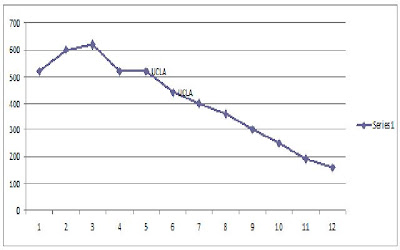
13. Obtain elevation measurements, from west to east along the UTM northing 3771000, where the eastings of the UTM grid intersect the northing. Create an elevation profile using these measurements in Excel Insert your elevation profile as a graphic in your blog.


14. What is the magnetic declination of the map?

  • 14 degrees

15. In which direction does water flow in the intermittent stream between the 405 freeway and Stone Canyon Reservoir?

  • South

16. Crop out UCLA from the map and include it as a graphic on your blog:


Thursday, October 1, 2009

Three Interesting Maps

The NYC Subway System

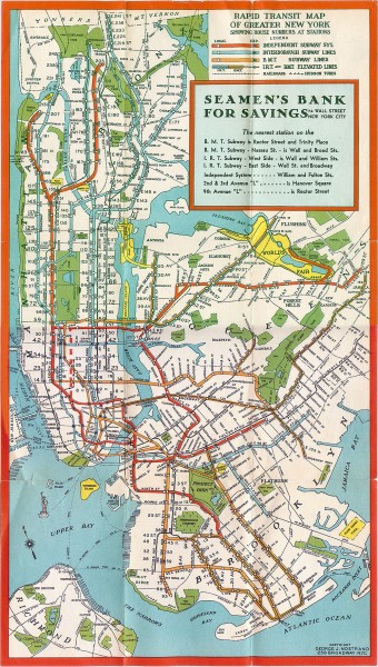
I found this map at the website www.mappery.com. Simply put, the website is a massive database filled with thousands of different "real life" maps. All of these maps either existed at one time, or are still accurate and in use today. This is a map of the New York City Subway system in 1930. The map shows all of the various subway lines that travel through not only Manhattan, but also the other four boroughs. It has different color codes for the different subway lines. However, not only does it show the subway lines, it also shows the geography of New York City. All of the rivers and parks throughout the city are all labeled clearly. What I find especially interesting about this map is its age. Even though it was created during the 1930s, it looks as though it could be a current map. Also, similar to all other transit maps, I find the various colors and designs of the transit system fascinating. The map perfectly captures the grid system of Manhattan.


Los Angeles From Above


This map was found at www.geology.com, a website filled with detailed information regarding Earth science and geography. The website also contains several maps of various geographic interest. This Landsat image provides the viewer with an aerial view of the Los Angeles Basin. Not only does it show the terrain, such as the hills, mountains, valleys, and oceans, it also provides a detailed map of the streets and metropolitan regions. What I find particularly interesting about this map is the intricate detail it provides. It is possible to trace the highways and clearly recognize the massive grid that Los Angeles was constructed upon.


The Literary City

This map was found at www.TheHarperStudio.com, an arts and entertainment blog. In this map, artist Ian Huebert uses famous literary quotes to divide the city of San Francisco into its unique districts. While the map may not be incredibly accurate, it still offers the viewer a clear view of the city from above. With any knowledge of the city, it is clear where one district begins and the other ends. What I find particularly interesting about this map are, first of all, the many colors, and second, the overall creativity. Huebert proves that maps can be a work of art, as well as a necessary tool for direction and movement.


Followers